Hey everyone!
Today I'm showing you some more pages of my 2009 December Daily made with the Hip Kit Club December Documented kit. I really really loved working with this kit. It made my life easy!! If you missed the beginning of the album, you can follow THIS LINK. It will bring you the the label "December Daily 2009" You'll also be able to see the album as it was before I decided to redo it. Maybe you'll understand why I wanted to redo it. ;)
Day 8
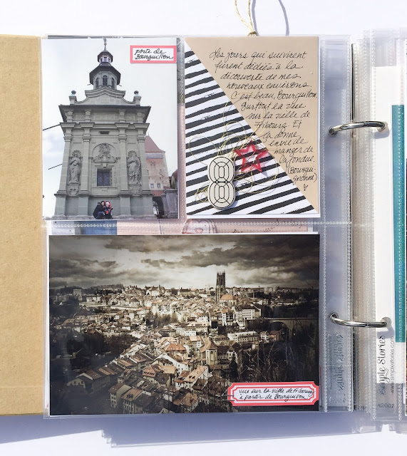
Day 8 focusses on my new "home". Walking around our new place. Discovering. I love the view over the city. That picture was,t taken on the 8. It was taken somewhen in February I think. But it's ok to mix things up. I wanted to document my new village, that's the way to go. Working with what I have. :)
Photo edited by my husband years ago. He likes to edit heavily. And to transform photos. It's not my style. At all. So I thought that this was bringing a touch of him in my album. :) And it fits with how I felt at that time, and with the grey sky of December.
Day 9
On Day 9 I could integrate another card received from Swiss friends. I wish I could have found all the cards I received that year.
6x8 pictures are the ones I love most. I went back to my old December Daily albums before starting this one and really, the large, full page pictures are the ones that grabbed my emotions most. So I'm going for it in this album too. :)
Adding small elements where there's place. Not too many, you don't want to disturb the viewer.
These little page protectors are perfect for instagram photos. But in 2009 there was no Instagram. I believe. So I went with the pictures that would fit best in a square format.
The side of that page has a long 8 inches opening and the thing that we put in there tend to slide out. So I used my fuse tool, once more and I took advantage of that to slip some sequins in before closing the pocket.
A patterned paper trimmed down to 4x4. Look for the motives on the paper to make yourself some extra journaling cards. With the motif on the left, I knew I would have plenty of space to write my story. And remember that all these triangles can easily become christmas trees. And that a cluster of the same object repeated is a great thing!!
My photos from 2009 are not the greatest, but it's fun to see where I come from also in the photography area. And Lightroom and Photoshop helped me a lot to make everything look nicer.
Again, this title was written with my brush pen. Great little thing to have when making a Christmas min-album!
So, are you getting ready to start your December Daily?? :)
Hope I can inspire you a bit.
Marie
Thursday, November 26, 2015
Wednesday, November 25, 2015
Pretty Little Studio | A Halloween layout
Hi everyone!!
Salut tout le monde!!
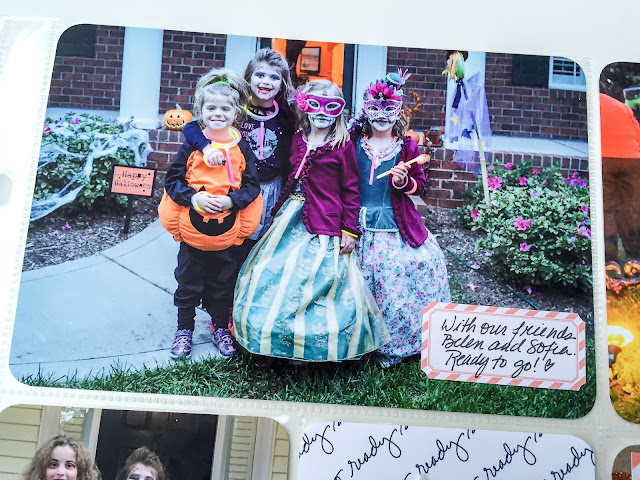
Today I'm sharing another Halloween layout I made with the Trick or Treat collection from Pretty Little Studio. Like I already said in a previous post, last year we spent Halloween at Disney. Well, not really Trick or Treating IN the park, but still, we spent the whole Halloween day at Magic Kingdom and went to Celebration to trick or treat. It was a fabulous experience!! I'm telling you, way better than having to wear our costumes over snow suits! ;)
Aujourd'hui j'aimerais partager une page que j'ai faite avec la collection Trick or Treat de Pretty little Studio. Comme je l'ai déjà mentionné il n'y a pas très longtemps, l'année passée on a passé l'Halloween à Disney. On n'a pas fait la cueillette de bonbon dans le parc, mais on a passé la journée à Magic Kingdom et on a passé l'Halloween à Celebration. C'était une super belle expérience. Bien mieux que de porter un costume en plastique par dessus un habit de neige! :)
I chose an orange background that makes my little princesses blue dresses stand out! And I used my Silhouette for that title that I cut out 5 times in black paper. I also played with repetition with my rub-ons from Heidi Swapp. I added a couple of journaling cards behind my photos and even wrote my journaling on one. :)
J'ai choisi un fond orange pour faire ressortir les robes bleues de mes petites princesses. Et j'ai utilisé ma Silhouette pour découper le titre 5 fois pour lui donner de l'importance. J'ai aussi joué avec le principe de répétition avec les rub-ons de Heidi Swapp. J'ai ajouté quelques cartes de journaling derrière ma photo et j'ai écrit mon texte sur une carte de PL de Heidi.
I added cute and shiny pieces here and there.
J'ai ajouté quelques beaux petits embellissements ici et là.
I'm really in love with all the Pretty Little Studios Die Cuts and flairs! I mean, really!! The quality is GREAT and the colors are vibrant, the motives bring me back to when I was a little girl. It's just perfection!
J'adore TOUS les die cuts et les flairs de Pretty Little Studio! Vraiment!! La qualité est superbe, les couleurs sont vives et les motifs me ramènent à quand j'étais petite. C'est la perfection!!
Did you do anything with your Halloween pictures yet?? :)
Et vous? Avez-vous scraper vos photos d'Halloween cette année?! :)
Marie-Pierre
Tuesday, November 24, 2015
One Little Bird Designs | November Guest Designer
Hey everyone!
Today I'd like to share my Project Life spread for the week of Halloween.
I made it entirely with One little Bird Designs kits: Ready Set Go, Sugarcoated, Pedal Pusher, Luna and Dialogue.
For the title card I cut out my letters with my Silhouette in glittery orange cardstock and I printed a frame from the kit on a piece of white cardstock.
I then placed a black cat my daughter had made me a couple of weeks ago.
This is a 4x6 card with lines for the journaling and a blank space on the right for a photo. I used a frame found in the Sugarcoated kit to print my photo.
For the "this Way" card I cut a 3x4 card out of glitter cardstock and placed the arrow and the stars over it.
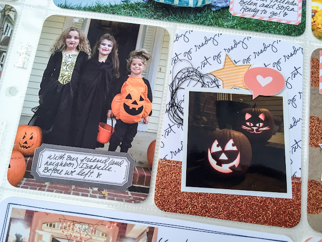
I try to repeat the glitter. Here I used it as a mat for my photo.
I try to put elements under the picture and over the picture to give more depth.
This glittery card is from MAMBI. I left a white space under the photo to give it a Polaroid look.
I love that paper look.
And so ends my Halloween week. Come back tomorrow for a traditional Halloween layout.
Marie
Today I'd like to share my Project Life spread for the week of Halloween.
I made it entirely with One little Bird Designs kits: Ready Set Go, Sugarcoated, Pedal Pusher, Luna and Dialogue.
For the title card I cut out my letters with my Silhouette in glittery orange cardstock and I printed a frame from the kit on a piece of white cardstock.
I placed them on the card with a little bit of adhesive and I ran them through my sewing machine.
I then placed a black cat my daughter had made me a couple of weeks ago.
This is a 4x6 card with lines for the journaling and a blank space on the right for a photo. I used a frame found in the Sugarcoated kit to print my photo.
For the "this Way" card I cut a 3x4 card out of glitter cardstock and placed the arrow and the stars over it.
I try to repeat the glitter. Here I used it as a mat for my photo.
I try to put elements under the picture and over the picture to give more depth.
This glittery card is from MAMBI. I left a white space under the photo to give it a Polaroid look.
I love that paper look.
This little sign post is also very cute!! And it was perfect for the story of my little girl who was tired of walking.
And so ends my Halloween week. Come back tomorrow for a traditional Halloween layout.
Marie
Monday, November 23, 2015
One Little Bird Designs | November Guest Designer
Hi everyone!
Today I'd like to share with you a layout I made with the new Honeycrisp Collection of One Little Bird Designs.
This collection is perfect for your fall layouts. I have put together photos from our trip to the corn maze and our afternoon at the park.
I've cut out the word "autumn" in vellum and stitched it in place to form a horizontal line on my layout. I placed photos above the line and under the line.
I cutout the beautiful frame with my Silhouette and added small details.
See you tomorrow for more One Little Bird Designs. :)
Marie
Saturday, November 21, 2015
One Little Bird Designs | November Guest Designer
Hi again and welcome to my second post of being guest designer for One Little Bird Designs.
For my second Project Life spread I used the collections: Agenda, Frolic and Sugarcoated.
For my second Project Life spread I used the collections: Agenda, Frolic and Sugarcoated.
There you go for One Little Bird for now. I still have 2 projects coming a little later. :)
Marie
Subscribe to:
Comments (Atom)


