Hello everyone!
Here I am again today with a second project made with my friend Mira's products.
If you missed my first post, you can catch up here.
To put you back in context, Mira, my friend on the Citrus Twist Kits design team, owns a small company called Family Portraits. They design their own products and also get some more products from other designers they love. Mira sent me a big box full (!!!) of lovely products and there was one mini album in the box, so I couldn't let this occasion pass me by! :)
Lucky enough (or very unlucky actually), my best friend in Prague is leaving this summer, so I decided to gather all our best moments and make her a mini album to remember the year we spent together in Prague. You know, making the best of a bad situation... I'm glad I have scrapbooking so that I can make things like that.
She's leaving at the end of the school year, so that leaves us a bunch of time to make more memories that I will add to the album. This means that the album is currently unfinished. I'll still show it to you in it's actual state and I'll show you the whole project once it's done, in June. :)
oh and for the records: lots of photos to come!!!
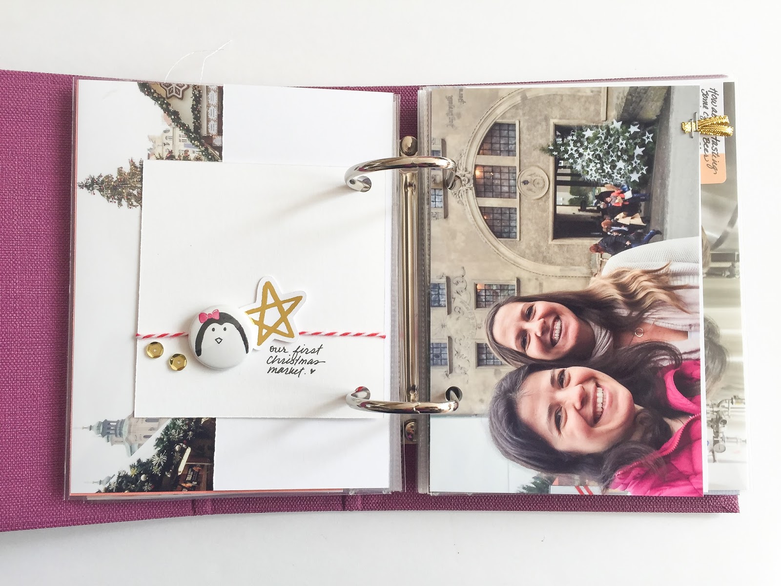
The album is really cute, small and compact! The page protectors fit a 4x6 photo (or card).
I wanted to use the page protectors, but I also wanted to have some textures in there so I decided to alternate page protectors and cards and photos out of the pockets.
The first page is a card (how perfect is it?!!!) on which I stitched some letter stickers spelling the word Prague. I added a
small heart sticker (love these tiny hearts!!!) and the date.
You will probably notice that the album is sometimes made to look at from the left and sometimes from the right... that's because I used both sides of the cards. I decided not to get distracted by that and to just go with the flow. :) It made my life way easier!!
I used the back side stitching to add a
sticker label.
I added a flair button on that big empty space. The orange clashes a little bit with the purple of the album but I thought it was getting all the oranges of the roofs. So for the color not to feel so awkward and out of place, I added a small orange sequin on the left page.
These
watercolor cards have to be my favorites!!! Here again, the orange mixed with some pink this time.
Here I used a
4x6 card that I cut down to a smaller size and I attached it with a mint green paperclip.
I like to print my photos with a white frame around it. I added a small sticker label to the top of this photos and stitched in the white frame. I glue some sequins in different shapes and colors for a playful feel.
A
kraft card with a hint of mint green was a perfect base to this photo of a painting exposition we visited. I used my brush pen to add a title and I punched a tab in on of my cards + attached a gold star with my tiny attacher.
This photo on the left page was happy on it's own, without any decoration. :)
On
this one, I added a
clear sticker under the photo and a mickey ears brad under my text. I bought these years (!!) ago and never used them. I'm glad I was organize a little and could find them easily when I needed them. Ha!
These circles in the middle of the
card are fun! They make a nice journaling spot when a 3x4 photo is placed on the card. I added some white stitching, alpha stickers and a gold star from my stash.
I really like playing with sequins to make color combos and to give a little bit of shine, whiteout using glitter. That wooden smiley face (I don't remember from which company I have it. Freckled Fawn maybe?!) is hiding the back of the Mickey ears brad.
Then I had to work with Christmas photos! ha! I was glad that there was a
pack of Christmas cards in my box. :) I really love the simple graphic on these cards and also the silly sayings. It was just the perfect touch to go with our silly Christmas photos. :)
I added a
small red star. Perfect addition to keep it clean and simple. I also love the cascade all these next layers of different sizes created.
This is now of my favorite photo. We don't often go to Starbucks here in Prague and this was probably the first time I had Starbucks since we had moved here. My friend was eating her sandwich and when I took the photo it stuck with us that she was my hand model. :) Also that red twine is symbolic because I was looking for it everywhere to use in my December Daily. I didn't find any. This piece was sent to me by Trina with my Citrus Twist Kits. Problem solved. lol It's good to have good friends in our lives isn't it?!
On the other side of that photo I wanted to add some small trinkets from my own Christmas line because that was also a subject that came often in our discussions. So here's a flair + a gold star die cut from my own collection.
Here I simply added a piece of golden ribbon that I folded in half to make a small textured tab.
A simple label sticker + a golden star is all this photo needed for the names. You know, this is a detail that I often don't include in my albums, the name of the people. But the truth is that years from now, we might forget the details as obvious as the names of our friends! I really wanted to include them all in this album!
Lovely card with just one big word. I added stitching (I checked the back of the card first to see if I could stitch without ruining the back side) an some sequins in Christmas colors.
On the other side I added a simple gold star.
The back of the stitching is not as nice as the front but when I stitch in white, it doesn't matter to me. Imperfect things only gives more texture and interest in my eyes.
I like that
small label with just a hint of color on one side.
Here too, one
sticker label does the job.
I added two small pictures that I adhered back to back. I wrote directly on the picture and I followed the side of the plate. I don't usually like to write on pictures but this time I think it looks cute.
And I absolutely love this card with a feather! For me, a feather means books and writing and ink.... so I added some black drops of ink. I was generous in the size of the drops. I like the end result very much.
I used a
purple label to go with the purple feather.
Here I used a small photo and a
sticker label in pink + a pink star from this
sticker sheet.
This tree was my friend's favorite tree in the city. I had to include it in a special way. So I decided to pint it onto textured cardstock to give it the look of a canvas.
Look at the texture in the bricks.
On this picture of the kids, I used the white space of the table to add a clear sticker.
And here a label and a gold star. I really wanted to embellish this album a lot and give it a special chunky feel but somehow simplicity came forth.
I had in mind to make a shaker pocket, but I thought that this card with the watercolor wash would be perfect to house some loose sequins. I went with gold and pink stars. And added one more big golden star with a tiny attacher.
I'm not closing the top of this pocket. I'm pretty confident that the sequins will stay inside if the album is not flipped.
Here are some more clear stickers and I also added a sticker label and a puffy flower sticker. I really like the pops of purple coming on and off throughout the album, picking up on the color of the album itself.
Here again I printed the photo on textured cardstock. I really love the look of a painting it gives to the photo. It works perfectly with this photo of the church.
On the back of the cardstock there is no texture so it's the perfect place to write! Here I used a brush pen. And I added one single tiny red heart sticker.
This photo was also printed on textured cardstock and I left a wide border at the bottom to give it the look of a polaroid. + it's a perfect space to add some notes.
I cropped the "be happy" photo to fit behind the "polaroid" print.
I added a tiny red star on top of the page protector here. These tiny stickers simply make me happy. :)
This is the last page of the album (for now). It's a crystal exhibition we've visited and it was funny because my friend photo bombed my nice crystal shot.
I added some letter stickers and a puffy sticker on the white space.
And loved the green repeated in the photo and on that card. :) I added some stitching and a puffy heart sticker.
That's it for now, but I already have some new photos of our adventures to add so I'll keep adding and playing until the end of may! yay!!
Talk to you again soon!!
Marie-Pierre