it's been a while!
As I am preparing for the Cutest video hop ever (come back tomorrow to see this go live and have a chance to win one of over 30 wonderful prizes!!!) I thought I'd share with you the last layouts I made for Get It Scrapped:
The first assignment was to create a scrapbook page about what I love scrapbooking most. I chose: scrapbooking about myself. Now, I realize that this may sound a little self centered, but it isn't really. What I love most is scrapbooking about when I was a kid. I have so many good memories that I want to record, either for me to look at later on, or for my kids, as they might want to know how life was like when their mom was little.
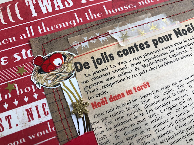
The layout I'm going to show you is very special to me as it includes a piece of newspaper I appeared in as I won a story writing contest. I have carried this piece of ephemera with me forever now, in all our crazy moves (!!) and I decided it was time to give it a home in one of my albums.
As you can see, I have the Christmas story I won the contest with on this, and also a picture of me when I went to pick up my price. I didn't think I needed another photo of me at that time. The newspaper article does the job! I did add journaling though to explain the page to the viewer.
I decided to go with this busy background because I loved the rich dark color, the vintage feel of it, and also all the Christmas song titles which to me made it look like a newspaper... My thinking was that my actual newspaper clipping was very bland. Although it's a little bit busy for the eye, I find that it makes the drab newspaper article pop out.
I used lots of Christmas die cuts to guide the viewer's eye toward what they needed to look at. Here the little bird is looking straight at the story.
This little owl is perched on the photo.
And that cute Santa and mice lead you to the sparkly title which, although it's sparkly, doesn't jump out of the page to get your attention.
I typed the journaling using my own handwriting and cutout strips of journaling. I used hot glue to adhere it forming waves and giving movement to that part of the page.
Here are more die cuts to frame the journaling. Notice how I sat the die cuts on that strips of gold paper? I added red stitches to reinforce the bottom line.
More die cuts directing the viewer's eye.
I also played with foam tape to create dimension.
Here I added the foam tape only at the bottom of the die cut.
You will find all the die cuts and elements you see on this layout at www.prettylittlestudio.shop
I hope you enjoyed this layout!!
It was a really fun one to make!
Don't forget to come back here tomorrow so that I can guide you over to the Video Hop and lots of fun prizes to win!! :)
Marie


2 comments:
This is so cool! Congrats on the prize and really great LO to document it!
Post a Comment