Today I'm showing you my last project as part of the Hip Kit Club Design Team. The end of my DT term came at the same moment as my move to Prague so I had no choice to step down from the team. Boo :( I had a blast creating for them for the past 6 months. Their kits are absolutely fabulous and I will for sure miss them. Let me tell you one last time that if you are looking for a kit packed with goodies, you might consider this one! :) So anyway, a HUGE THANK YOU to Kimberly who was so kind and generous to me. xox
And here's my spread:
I really love the light and airy look.
I often have pictures in the middle row, but not this time. This time I used the middle row to journal about the 2 stories represented, for one title and for embellishing.
Sometimes, less is more. I really liked the light on this picture so I kept the embellishing to a minimum. Neutral colored embellishments are a good way to embellish in a subtle way.
I love this photo!! My little one had decided her first wiggly tooth was coming out that night! And Big Sister was so happy and intrigued. I really love the complicity between the two sisters. I always have my iphone with me when it's bath time (I use the music to put them to sleep afterwards) so it was easy to pull it out and snap this not so perfect picture. I was really close to them and had to act quickly. It totally works.
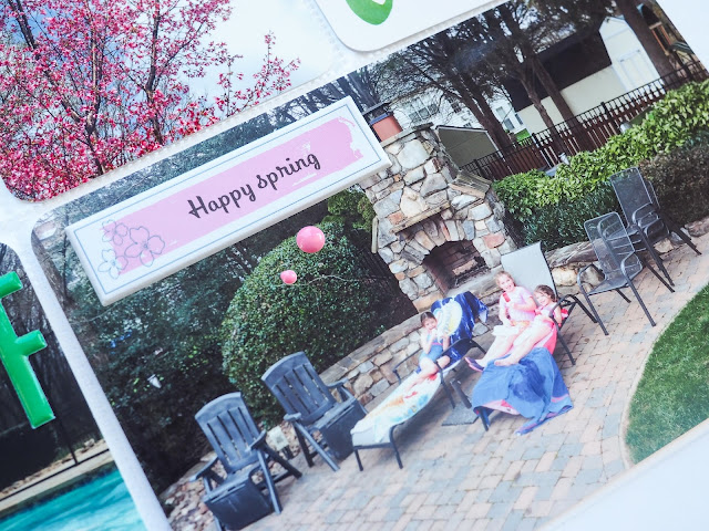
These 2 cards, under the nice photo of my girls in the sun room are explaining that they are writing a paper for the inscription to their new school in Prague.
Here's the story of the wiggly tooth and some embellishing. I really love what's written on this cork sticker.
I used the two bottom photos to write another title. When reading both of them together you get "friends forever".
I added this bis die cut to write more of the story and to hide the wide wall area that was taking away from these two cute little faces.
The *, the enamel dots and the wood veneer heart are tying this photo with the previous one.
The right page is less white but still has the same feel as the left page.
I used embellishments to hide several things on the photo that were distracting and plain ugly.
I love the cozy/homy look of the wood veneer. It's very "warm"...
I embellished much less on this spread than on other spreads I've done before with the hip Kit Club's kits but maybe that's what brings my page to breath more. I've let the colors of the pictures shine.
Love this fairly lare cork bird sitting on a branch die cut and surrounded by enamel dots. The stitching up there adds lots of texture and interest. I love how this card turned out.
That cute green heart was just perfect on that card!! I really love how the yellow of the enamel dots make the yellow from the card pop out.
Big numbers are great to use for dates, ages, of here for temperature.
And I finished my spread with a simple pink puffy sticked and a couple of pink enamel dots.
Voilà! :)
I hope you liked what I did with the Hip Kit Club kits and I hope I could inspire you a bit, or a lot!! :D I sure hope that you will still follow me even though I won't be using the kits anymore. You can certainly easily translate my embellishment ideas with anything you have in your stash that's for sure!!
So if you like what you see here, go ahead and become a member. :)
I hope to see you around!!
Marie


1 comment:
Such great pages ... and best of luck with your big move!!
Post a Comment