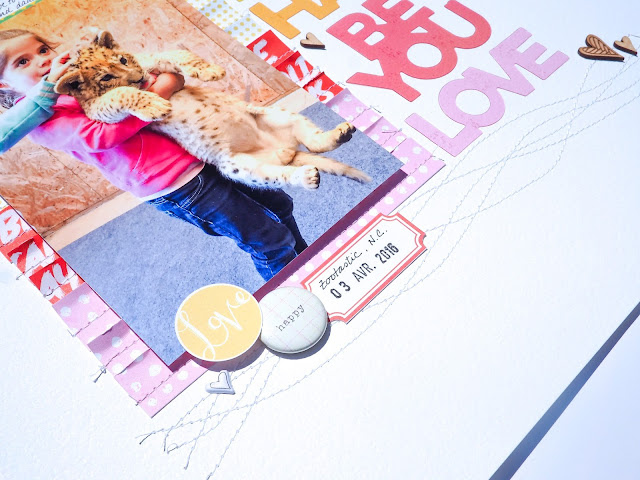
Yesterday I had a page on the Citrus Twist Kits blog. I made a 12x12 layout using my April 2016 Project Life and my Sprinkles kits. I already told you that it's my treat to make a traditional layout after I made 3 project Life spreads. :) And this time even more so since I thought the acetate words were over the moon gorgeous and I couldn't wait to pair them with one of my favorite photo of the moment.
I started my layout with a white cardstock so that my acetate words would pop out of the layout!
I then paired the patterned papers wit the colors of the words and I layered them + stitched and distressed the edges under my photo. I really love the dimension.
So that the colors could stay the focus of the page I played with some white on white for the title.
And I repeated the same white on whit at the bottom with white stitching. I added a cluster of embellishment at the bottom of my photo.
And sprinkled wood veneer here and there (I formed a diagonal line going form the bottom right to the top left). I love that the wood veneer are a neutral color. They don't compete with the colors of the layout, they only add to them.
Voilà! Short and sweet. :)
Have a great day my friends!! And if you like my page, go ahead and pin it for me. :)
Thank you!!!
Marie-Pierre


2 comments:
Best use of those acetate words I've seen yet, stacked and paired with the same color papers. And I love the texture of the paper and stitching
Just love that page! Love your rainbow of words and love the white on white title. And really love the sweet photo!
Post a Comment