Hi everyone!!
It's been a week since my last post. Time goes by so fast!! Especially because I have my parents with me right now, visiting from Canada. I'm trying to squeeze in as much things as possible including: cleaning up the house (hard core cleaning), chatting and catching up (because talking over the phone is just NOT the same!), shopping... :) And of course still doing everything I usually have to do when my parents are not here like: volunteering in my kids' classes, attending after school activities, attending Easter activities... So this leaves little time to scrapbooking. Thankfully, my Design Teams' assignments are there to keep me scrapping a little. :D
Oh! And I also have to tell you, if you don't know already, last Tuesday I was on the Live Inspired Podcast with Tracie Claiborne. I had a blast and I talked AS FAST AS I COULD (Geez!) to say as many things as I possibly could in less than one hour. LOL I listened to the interview and it was... funny?!! You tell me how you liked it. ;) lol To listen to the interview, click on this image. It will open a new page:
THANK YOU so much for having me, Tracie!!!!!
.......
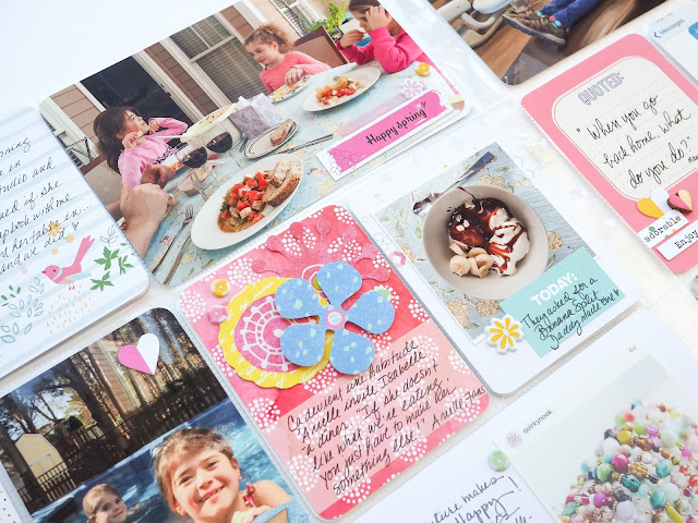
So anyway, back to the main purpose of this blog post: here is a Project Life spread I made with the Hip Kit Club March 2016 kits. :)
I find this page to be different than my other pages. I tried to make it very light, so I picked the whitest papers from the kit and printed some small square photos that would let the papers show.
Left page:
Ok, one thing: The Pinkfresh studio paper is divine. <3 colors="" drops.="" i="" ink="" lines="" love="" motives="" p="" the="">
Cute card from the Hip Kit Club PL kit. I really love the watercolor look and the fresh and happy colors. I added a puffy yellow sticker to balance the page. And I stitched through the words with white thread.
Although I wanted a light overall look, I felt like the layout needed some punch. That red card with white design was great to make everything else pop. I added some flowers from the Basic Grey flower die cut package instead of a photo. This way we can still see plenty of red showing through the petals. And I used the blocked area at the bottom of the card to write some journaling.
Here I used a small 3.5x3.5 photo on a 4x6 paper and I added two cards from the PL kit as additional layers. I mounted my photo on foam dots and wrote my journaling with my typewriter of journaling strips.
Look at this GORGEOUS photo from my friend Christine Middlecamp aka The Quirky Nook. It just makes me so super happy and I often have her easy shop open on my screen just because looking at her photos makes me happy. So I decided to include one of her photo into my pages. I must say that I also own 3 of her original pieces. :)
Right page:
Nothing like an ugly photo at the dentist...right? Well, with a little embellishing it's all good. :) lots of brown and "lovely" green walls, but it only takes a small die cut and a screen printed wooden heart from Pinkfresh Studio to steer the eye away from the ugly. :D
I loved that the kit contained wooden hearts but also paper hearts that were the same style. This way you can mix them. That's pretty cool!
Sometimes, some words are better than a picture. It's the case here where I made a screen shot of my iPhone with the conversation my little angel had with me when I dropped her at school that morning. And because I really wanted it to stand out and not be overlooked, I repeated the story on a journaling card, right next to it.
Here again, a mix of the die cut and wooden hearts. And down there two little puffy sequins of the same colors.
On this yellow card, a 4x6 cut into a 3x4 card, I made a collage of flowers from the Basic Grey kit. I like that the grey triangles are showing and act as arrows.
Loving wood veneers. Always!
Gathering lots of embellishments of the same shape is always a good idea. Here I kept everything in the same colors so that it wouldn't compete with the nice picture of the blooming tree.
Have fun creating my friends!! :)
Oh and once again, here' the link to my interview with Tracie Claiborne on Live Inspired!
Enjoy,
Marie


No comments:
Post a Comment