Wednesday, April 5, 2017

Family Portraits | Mini album

Hello everyone!
Here I am again today with a second project made with my friend Mira's products.

If you missed my first post, you can catch up here.

To put you back in context, Mira, my friend on the Citrus Twist Kits design team, owns a small company called Family Portraits. They design their own products and also get some more products from other designers they love. Mira sent me a big box full (!!!) of lovely products and there was one mini album in the box, so I couldn't let this occasion pass me by! :)

Lucky enough (or very unlucky actually), my best friend in Prague is leaving this summer, so I decided to gather all our best moments and make her a mini album to remember the year we spent together in Prague. You know, making the best of a bad situation... I'm glad I have scrapbooking so that I can make things like that.

She's leaving at the end of the school year, so that leaves us a bunch of time to make more memories that I will add to the album. This means that the album is currently unfinished. I'll still show it to you in it's actual state and I'll show you the whole project once it's done, in June. :)

oh and for the records: lots of photos to come!!!


The album is really cute, small and compact! The page protectors fit a 4x6 photo (or card).


I wanted to use the page protectors, but I also wanted to have some textures in there so I decided to alternate page protectors and cards and photos out of the pockets.

The first page is a card (how perfect is it?!!!) on which I stitched some letter stickers spelling the word Prague. I added a small heart sticker (love these tiny hearts!!!) and the date.


You will probably notice that the album is sometimes made to look at from the left and sometimes from the right... that's because I used both sides of the cards. I decided not to get distracted by that and to just go with the flow. :) It made my life way easier!!


I used the back side stitching to add a sticker label.


I added a flair button on that big empty space. The orange clashes a little bit with the purple of the album but I thought it was getting all the oranges of the roofs. So for the color not to feel so awkward and out of place, I added a small orange sequin on the left page.


These watercolor cards have to be my favorites!!! Here again, the orange mixed with some pink this time.


Here I used a 4x6 card that I cut down to a smaller size and I attached it with a mint green paperclip.


I like to print my photos with a white frame around it. I added a small sticker label to the top of this photos and stitched in the white frame. I glue some sequins in different shapes and colors for a playful feel.


A kraft card with a hint of mint green was a perfect base to this photo of a painting exposition we visited. I used my brush pen to add a title and I punched a tab in on of my cards + attached a gold star with my tiny attacher.


This photo on the left page was happy on it's own, without any decoration. :)


On this one, I added a clear sticker under the photo and a mickey ears brad under my text. I bought these years (!!) ago and never used them. I'm glad I was organize a little and could find them easily when I needed them. Ha!


These circles in the middle of the card are fun! They make a nice journaling spot when a 3x4 photo is placed on the card. I added some white stitching, alpha stickers and a gold star from my stash.


I really like playing with sequins to make color combos and to give a little bit of shine, whiteout using glitter. That wooden smiley face (I don't remember from which company I have it. Freckled Fawn maybe?!) is hiding the back of the Mickey ears brad.


Then I had to work with Christmas photos! ha! I was glad that there was a pack of Christmas cards in my box. :) I really love the simple graphic on these cards and also the silly sayings. It was just the perfect touch to go with our silly Christmas photos. :)


I added a small red star. Perfect addition to keep it clean and simple. I also love the cascade all these next layers of different sizes created.


This is now of my favorite photo. We don't often go to Starbucks here in Prague and this was probably the first time I had Starbucks since we had moved here. My friend was eating her sandwich and when I took the photo it stuck with us that she was my hand model. :) Also that red twine is symbolic because I was looking for it everywhere to use in my December Daily. I didn't find any. This piece was sent to me by Trina with my Citrus Twist Kits. Problem solved. lol It's good to have good friends in our lives isn't it?!
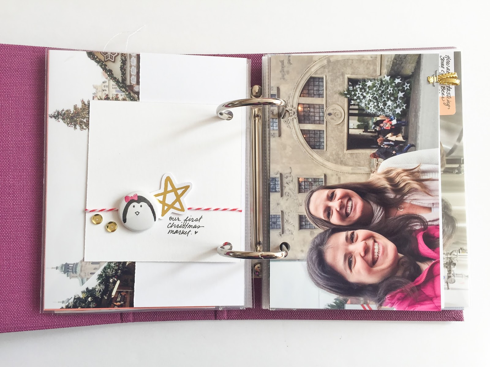

On the other side of that photo I wanted to add some small trinkets from my own Christmas line because that was also a subject that came often in our discussions.  So here's a flair + a gold star die cut from my own collection.


Here I simply added a piece of golden ribbon that I folded in half to make a small textured tab.


A simple label sticker + a golden star is all this photo needed for the names. You know, this is a detail that I often don't include in my albums, the name of the people. But the truth is that years from now, we might forget the details as obvious as the names of our friends! I really wanted to include them all in this album!


Lovely card with just one big word. I added stitching (I checked the back of the card first to see if I could stitch without ruining the back side) an some sequins in Christmas colors.


On the other side I added a simple gold star.


The back of the stitching is not as nice as the front but when I stitch in white, it doesn't matter to me. Imperfect things only gives more texture and interest in my eyes.


I like that small label with just a hint of color on one side.


Here too, one sticker label does the job.


I added two small pictures that I adhered back to back. I wrote directly on the picture and I followed the side of the plate. I don't usually like to write on pictures but this time I think it looks cute.


And I absolutely love this card with a feather! For me, a feather means books and writing and ink.... so I added some black drops of ink. I was generous in the size of the drops. I like the end result very much.


I used a purple label to go with the purple feather.


Here I used a small photo and a sticker label in pink + a pink star from this sticker sheet.


This tree was my friend's favorite tree in the city. I had to include it in a special way. So I decided to pint it onto textured cardstock to give it the look of a canvas.


Look at the texture in the bricks.


On this picture of the kids, I used the white space of the table to add a clear sticker.


And here a label and a gold star. I really wanted to embellish this album a lot and give it a special chunky feel but somehow simplicity came forth.


I had in mind to make a shaker pocket, but I thought that this card with the watercolor wash would be perfect to house some loose sequins. I went with gold and pink stars. And added one more big golden star with a tiny attacher.


I'm not closing the top of this pocket. I'm pretty confident that the sequins will stay inside if the album is not flipped.


Here are some more clear stickers and I also added a sticker label and a puffy flower sticker. I really like the pops of purple coming on and off throughout the album, picking up on the color of the album itself.


Here again I printed the photo on textured cardstock. I really love the look of a painting it gives to the photo. It works perfectly with this photo of the church.


On the back of the cardstock there is no texture so it's the perfect place to write! Here I used a brush pen. And I added one single tiny red heart sticker.


This photo was also printed on textured cardstock and I left a wide border at the bottom to give it the look of a polaroid. + it's a perfect space to add some notes.


I cropped the "be happy" photo to fit behind the "polaroid" print.


I added a tiny red star on top of the page protector here. These tiny stickers simply make me happy. :)


This is the last page of the album (for now). It's a crystal exhibition we've visited and it was funny because my friend photo bombed my nice crystal shot.


I added some letter stickers and a puffy sticker on the white space.


And loved the green repeated in the photo and on that card. :) I added some stitching and a puffy heart sticker.


That's it for now, but I already have some new photos of our adventures to add so I'll keep adding and playing until the end of may! yay!!

Talk to you again soon!! 

Marie-Pierre

Friday, March 31, 2017

Family Portraits | Project Life 2017

Hey everyone!!

2 big new to share today!

First, Mira, my friend on the Citrus Twist Kits design team, asked me to be a guest designer for her small company Family Portrait! I accepted happily. I love Mira, and was very pleased with everything she sent me!!

Second big news, I think I was waiting for Mira's product to start my Project life album 2017! Yes! I wanted to do it this year, but it's march 30th now and I just havent started. That's life reality. I'm sure you know what I'm talking about. We're trying to fit it all in, but it just doesn't work.

This being said, I would like to show you the first project I made:


Before I tell you all about this page, I'd like to tell you that I didn't finish my Project Life album last year. I wanted to keep it easy and simple so I didn't limit myself to make a streak a week and well, it got complicated very fast and it resulted in a non finished album. :(

So this year, Yes, this year (!!), I want to be wiser. And I want to succeed! Ok, true, last year I moved from the USA to Prague. I could say it's because of that, but the truth is that I'm not moving this year, and I don't see the tempo of my life slowing down. Not one bit! So move or not, if I go on the same path as last year, I will not finish my album, and it won't be fun to make it either, that's for sure. So my plan for this year: One spread a month! Yes! Go simple or go home is my new saying! :D On top of that, the only spread will be simple! Very simple! I won't try to cram every little moments and things that happened and I will also not try to describe everything in the journaling. So let's see how I started, shall we?


Opening page = one photo of us. My parents are the picture too but I don't mind. Simplify! Don't look for the perfect photo for another hour, just take that one!! :)

The year on a card. I used some transparent stickers for the 2017 and I wrote "this is us" with my brush pen.


Two 3x4 cards. One with lovely words and one with a pretty drawing of a house.

A shaker pocket with some really sweet sequins and a "love" speech bubble paperclip from Pinkfresh Studio.

One 3x4 card to talk about us as a family. Where we are, what we do, our way of life.


For my journaling I used a blank card + a tiny heart sticker.


One 4x6 card with the letters US stitched on top.


And one 4x6 card with the description of every member of the family. I wrote our age, what we were doing/liking at the moment and what was coming for us this year. I kept it very very very simple!

Second page:


Yes, this is January at a glance! Fun, isn't it?
I left out many many stories, believe me!! Some of them are on separate 12x12 scrapbooking pages, and some others are just not told. That's the way it is. For me. For now.


I used the first 4x6 card to write the month.


I included 5 photos on the left page. They are all different sizes. I loved the cards and wanted them to show, and to add a little bit of color and of softness with the watercolor look.


I used one 4x6 card that I've cut in half to add journaling. My journaling is very general. I'm not trying to describe every photo like I did in my 2016 album. Hoping that this will help.


This year, I decided that I'm fine with something like this. Just a photo on a card.


6 photos on the second page.


And one cute 4x6 card with a beautiful word art saying it all!


Sometimes we buy a pack of cards and theres one that says something that doesn't relate to your life or album, well, you can use that card to mount a photo that you will print slightly smaller to add just another pop of color. Most likely, the color will coordinate perfectly with your other cards from the same pack.


The art work on these cards is so pretty that I wanted it to shine. So I didn't write anything on that last cards like I had intended to do. And that brings me back to keeping it simple. I added that story to my general journaling card. There are less details about the story but I'm fine with that.

Now I "only" have to keep going right? The hardest step is the first one...!

I for sure still have plenty of beautiful cards from Family Portraits so I should be good to document a couple more months with them.

Before I go I'd like to thank Mira for the opportunity of getting to know her small company and for trusting that I would do something beautiful with her products!! <3 nbsp="" p="">
Marie

Tuesday, March 28, 2017

Citrus Twist Kits | Dubai

Hello everyone!!

Here I am today with a very long blogpost and lots of photos to inspire you!!!

I created this double page layout to document my day trip to the sand dunes in Dubai.


I would really love for you to head over to the Citrus Twist Kits blog post to read all about my process of putting it together. I assure you that you will look at it in another way after reading that!! :) And I hope that it will inspire you to scrapbook yourself, starting from scratch.

Thanks for coming by and have a wonderful day!!

Marie

Thursday, March 23, 2017

Citrus Twist Kits | Documenting a trip

Hi everyone!

How do you document a trip you really really liked and have 500 great photos from that trip? Do you just forget about it and do nothing? Because that wouldn't be the way to go...

As you know it, not long ago, I came back from a trip to Dubai and I really loved it and didn't want to miss the chance to document it so here's how I went about to document it:

1. I wrote a blogpost. I didn't want to forget anything and I thought that was the best way to go. Journal. And add some pictures maybe too. It took me some time. Maybe a half day, but I'm glad I did it because when I had the chance to scrapbook my trip, weeks later, I had already forgotten so much information and I was happy to just look back at my blog post. I was also happy that my best pictures were already selected.

2. I did a layout about the BEST part of the trip! For me it was my day in the sand dunes. I'll tell you more about this layout very soon on the Citrus Twist Kits blog as part of a tutorial showing you how to build a double page layout with lots of photos and journaling.


3. I did a layout that serves as a summary of the trip. I didn't want to tell everything on that page, nor display all my best pictures, but I wanted to give a feel of the trip and show several activities we made.

It's this layout:


The title is "welcome to Dubai" and I chose lots of pictures of my husband an I, including the forbidden kiss at the top of Burj Khalifa. A photo at the beach, one of our hotel room number in arab and roman numbers. :) The Burj Khalifa and Dubai mall, the view at the marina (where we were staying), our favorite tea place with fresh dates and palm tree reflection in the glass of the table. The whole trip is not there. The sand dunes are not there for example, but the main of the trip is there.


I didn't use a lot of products either. Look.  A white background and just some embellishments here and there. Sometimes, you just have to stop overthinking everything and to over complicate everything. Simple is good. And what you want are your pictures and the story, right?!


Sorry for the inappropriate photo.... my daughter wasn't happy with this. But it was kind of a big part of the trip because we (or I) were a little bit nervous about that whole thing of not being allowed to hold hands in public.


The journaling sums the trip up. Not all details are there, but I knew that more pages were coming. :)


4. I then did a layout about the 2nd most interesting thing during my trip: the top of Burj Khalifa.


As you can see, it doesn't take much to make a scrapbook layout! Only a story to document.


I really wanted to incorporate these 2 tickets on my page so that's the first thing I did: find them a place. I then played my photos as it made sense, playing around to see how I could fit them in the space I had left. I decided I'd isolate the small picture of the tower to give it some more "power".


I mounted in onto a piece of colored paper and I added some details net to it. Adding enamel dots to act as bullet points. I used te stamp to add the subtitle "highlights".


I played a little bit with the papers I had in the kit to customize this tag. I really love that the kit comes with a bit of twine. I love adding it to my layouts. :)

I journaled in the space I had left. Story documented!


And theres a 3rd page made to document my trip. How awesome is that?
But I wasn't done yet!! I really wanted to incorporate more pictures that I had already printed in various sizes, and I wanted to document the mall + the day at the beach/souk/some more favorite moments.

5. So I made another simple page:


I used a colored background, just because I was getting to be tired of the pure white. Ha! :) And that turquoise fitted nicely with the feel of my mall photos.


Once again I used an ephemera, the mall guide! I had never seen a mall guide this thick. And a mall as beautifully done as this one!! So I really wanted to incorporate the guide in my book.

Because I wanted it to be easy to take out of the pocket to look at it, I've put it at the top of the page. It's a very thick and heavy book though, I'm not sure if it will hold in my album. Worse case scenario, I'll with the paperclip for a mini gold bulldog clip. But at least, this way, we only have to pull the page up an inch to have access to the brochure.


I used 2 3x4 cards from the Pocket Life kit to add my journaling and I basically just played around with the photos to see how they could fit.


6. I made one last layout with the rest of my photos:


Again, this layout was all about find a spot for all the pictures. How to position my photos so that it makes sense and so that it all fits!


I gathered together the beach photos, the evening at the marina + tea photos, and finally I used the last spot for the Burj al Arab and souk (no photos) we visited. The details are all in the journaling.


For my night photos I was happy to use a darker background paper.

Notice that I added the little bag of tea that I brought for that purpose. I really loved the shine of the gold on it. :) You know you're a scrapbooker when you bring back what others consider trash. lol


Ha, also, I numbered these 2 last pages to show the days and the order we did these things. On my blog, when I told the story of Dubai, I separated the things in 2 ways: first, by day, second, by event/places. I kind of liked it. On my pages, it's not that clear. But I hope that the 1 and 2 will help me make sense of it all when I look back on those pages in some years. I'm still not sure the order I'll put the pages in in my album, and also, maybe I'll add a number 3 on my sand dunes pages.


So that's it for my Dubai trip. It was quite a experience to document all this and it was fun to relive the trip. :) I ended up with 5 pages (one of them being double) and lots of stories and details. Not everything is there, and not every photo I love is there either, but the essence is there. I'm happy. :)

I hope this helps you make sense of it all and I hope you'll revisit this post when you'll be ready to document a bigger trip. I especially hope that you WILL document your next big trip, and that the photos AND stories will find a home in an album!!

Marie-Pierre